Research
Background
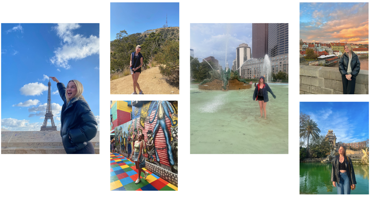
Where do I even begin in telling the thought process behind this cherished idea I have for how social media can be used to enhance urban life and culture. The idea for this project came from my love of and interest for urban spaces! 🌆❤️ From the collage below of me in some of my favorite municipalities, I hope you can tell that I really love cities!!! To think what it takes to bring millions of people together through history and culture, neighborliness and a shared sense of identity, municipal services and third spaces... It’s a topic I can go on and on about and quite often do. 🤓 Plus, I'm named after the great city of Paris, which is pretty much just the blueprint of everything that makes a city great, so in a way I was destined to be an urban enthousiast.
Anyways hopefully we’re in agreement that cities are awesome! I studied Urban Studies as part of my undergrad degree where I learned all about city planning, urban design, urban history, municipal services, etc. My classes and professors taught me to think about how cities are run and how they can be run better. If you ever catch me at a community event or navigating public transit or walking down a busy commercial corridor, chances are I’m thinking about the thought, planning, and care that goes into making cities awesome. I had many experiences in my undergrad degree that gave me a strong appreciation and unique insight into urban life and that’s where my idea for Urbie all started! I hope to create a social media app focused on urban life and culture that touches at the very heart of how I think cities should be run. I see this platform as a powerful tool for placemaking, community building, and local business development – ultimately helping people feel more rooted in the places they live.
Design Process
While I already had a pretty strong vision for the app from the get-go , I went through the following design process to ground my design in real needs, community voices, and patterns of engagement that already exist in cities today. The best part of my research was really just talking to my friends about what they thought of the app and how they would use it. Definitely one of those projects where I have been reluctant to stray from my vision, but talking to people and conducting user research has added some strong improvements and creative features to the app.
User Interviews/Survey
My user research got started with having a few conversations with some friends about their experiences living in urban areas, connecting to urban communities, and how social media could make those experiences better. I used the following questions as a starting point.
– Can you describe a time when you felt truly connected to your city or neighborhood? What made that moment feel meaningful?
– How do you usually hear about what’s happening in your community?
– How do you use digital tools or social media to engage with your city?
– Can you think of a time when an app, post, or online resource helped you discover something cool in your city?
– Do you feel like existing platforms (Instagram, Nextdoor, Facebook groups, etc.) meet your needs when it comes to finding local community or events?
– Have you ever made a real-world connection (friendship, group, experience) because of something you found online? What made it stick? What stops you from getting more involved in your local community?
– Are there moments when you’ve wanted to do something in your city (attend an event, meet new people, support a local cause) but didn’t? What got in the way?
– What feels missing when it comes to how people connect, share, or discover things in urban life?
– How would you define a “healthy” or “thriving” urban community, and what role could tech play in supporting that?
I also sent out a survey to get a sense of how people already use social media to connect to urban areas and how a platform specifically tailored to this purpose could enhance their ability to do so. The following are some examples of results from the survey that guided the design and user expereince of Urbie.
Research Synthesis
After conducting user interviews and distributing the survey, I began the process of synthesizing what I had learned. Using affinity mapping, I grouped responses and reflections into thematic clusters, searching for patterns in how people think about city life, engage with their communities, and use digital tools in the process.
User Testing
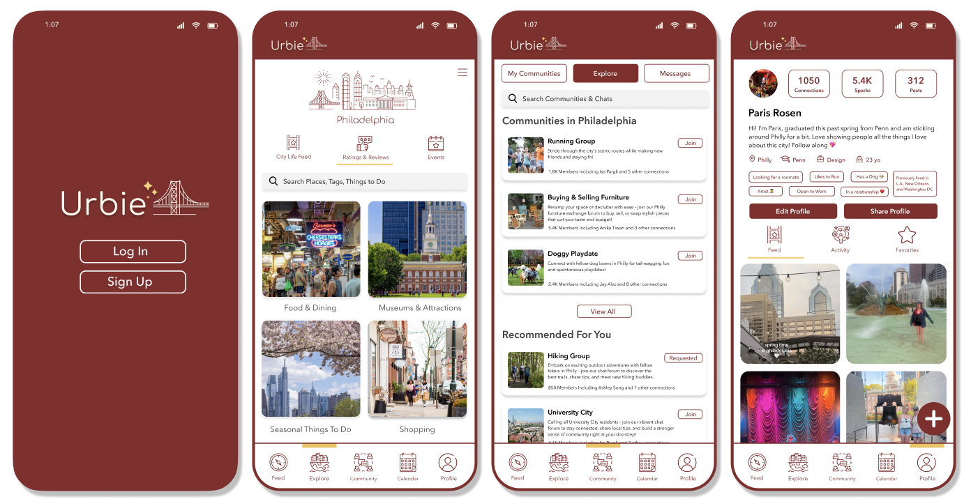
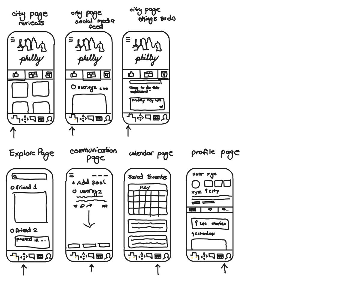
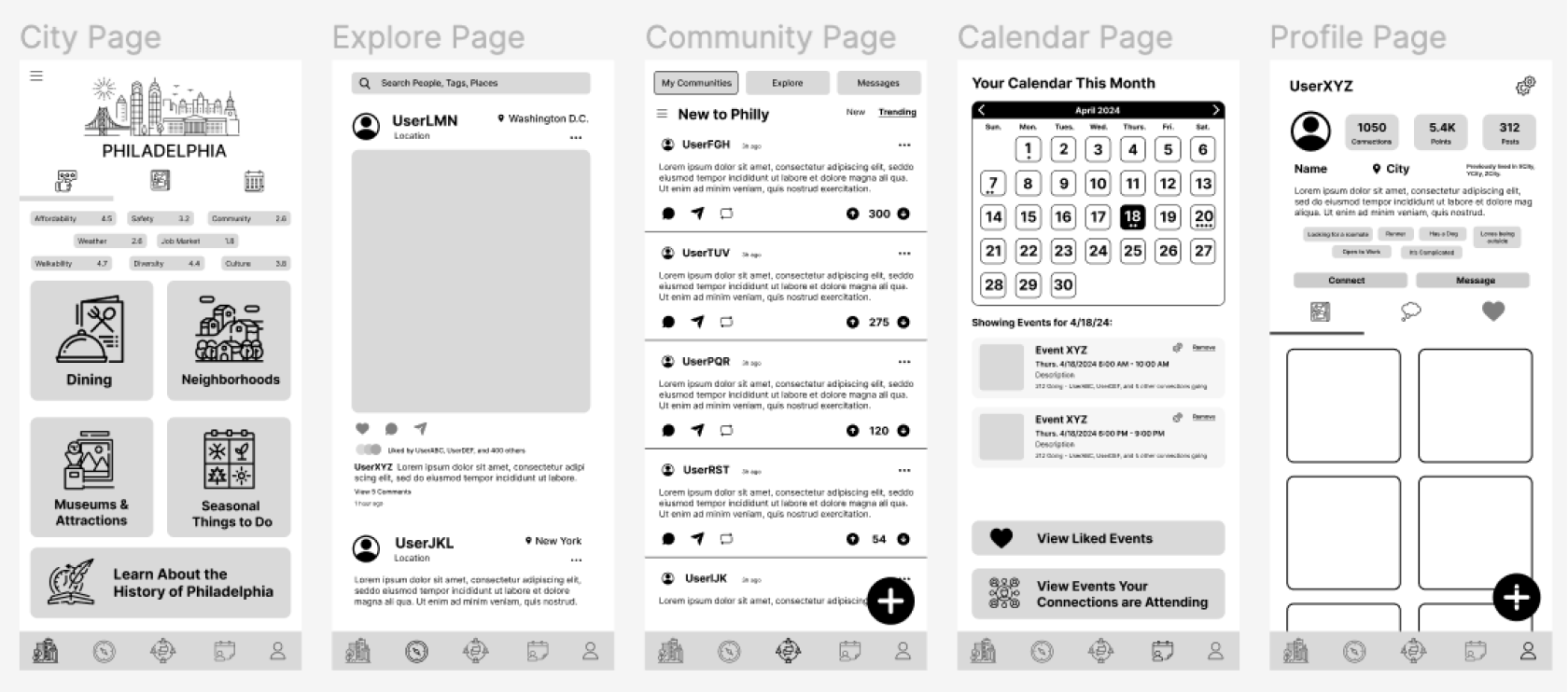
User testing played a crucial role in shaping the direction of this app from early concept to polished interface. I conducted testing sessions with a group of target users, guiding them through hand-drawn sketches, low-fidelity wireframes, and high-fidelity mockups that included branding and navigation flows. These sessions helped me observe how users interacted with different design elements and provided valuable insights into how intuitive the app’s navigation structure felt, what features users gravitated toward, and where confusion or friction emerged.
Through this process, I gained a deeper understanding of user priorities — such as the need for quick access to events, visual clarity in the feed, and an intuitive map experience. Their feedback directly influenced layout decisions, feature placement, and interaction design in the final version of the app.
User Personas
Interview Questions Based on Low-Fidelity Wireframes:
- Can you describe what this screen is for?
- Where would you click if you wanted to find an event?
- Is there anything confusing about the layout?
- What feature are you most likely to use first?
- How does this design compare to other apps you use?
User Testing Insights:
- Users felt the app’s navigation structure was intuitive, making it easy to switch between feeds, events, and profile pages without confusion.
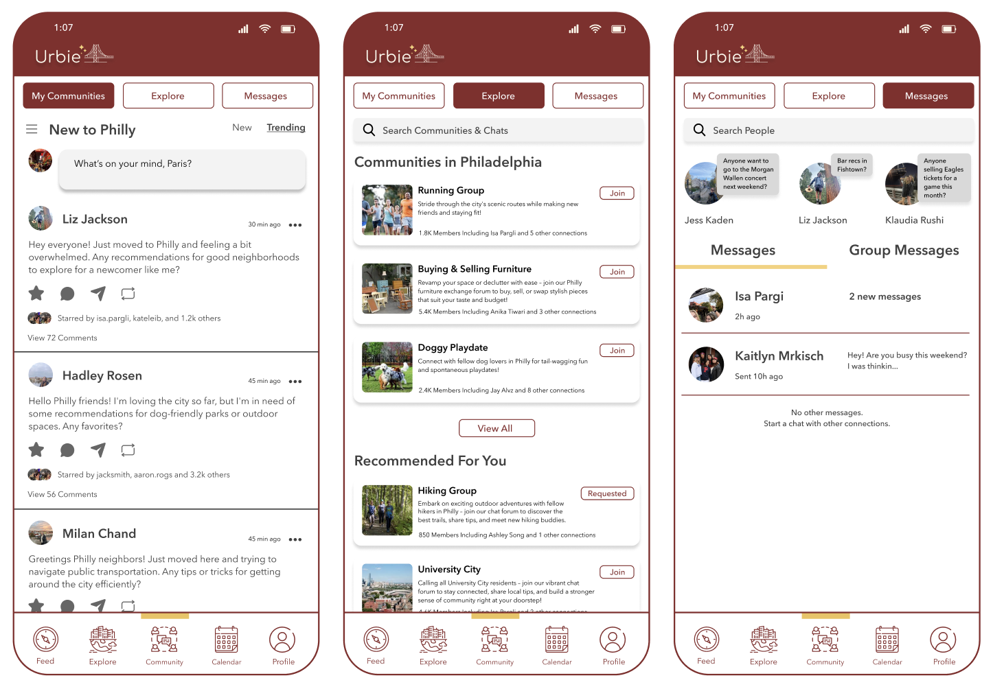
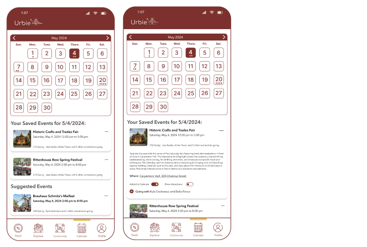
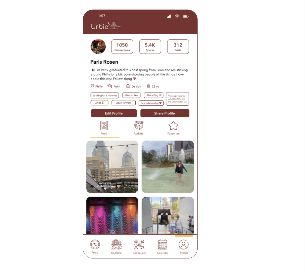
- One change to the navigation is that users preferred having the app's entry point be a feed that shows relevant content rather than the app opening to an explore page. Users felt like it would be beneficial to divide the feed into one that solely shows content of the city they live in and one that shows content of friends they have connected with. Overall, this preference points to the fact that the social media and content sharing features of the app are a user priority.
- One user brought up that it could be cool to add a map feautre to the app that allows users to see places, events, and friends that are nearby.
- Users responded positively to the idea of community groups, highlighting that interest-based spaces (like run clubs or swap groups) would make the app feel welcoming and purposeful.
- The concept of combining suggested content with local events sparked excitement, with users saying it would motivate them to discover new places and activities in their city.
- Users commented that the design language made the app feel fun, polished, and inviting, which increased their excitement and ability to explore its features
Conclusion
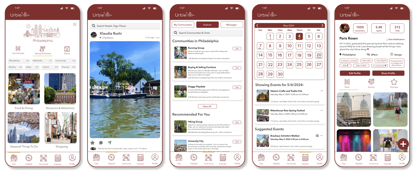
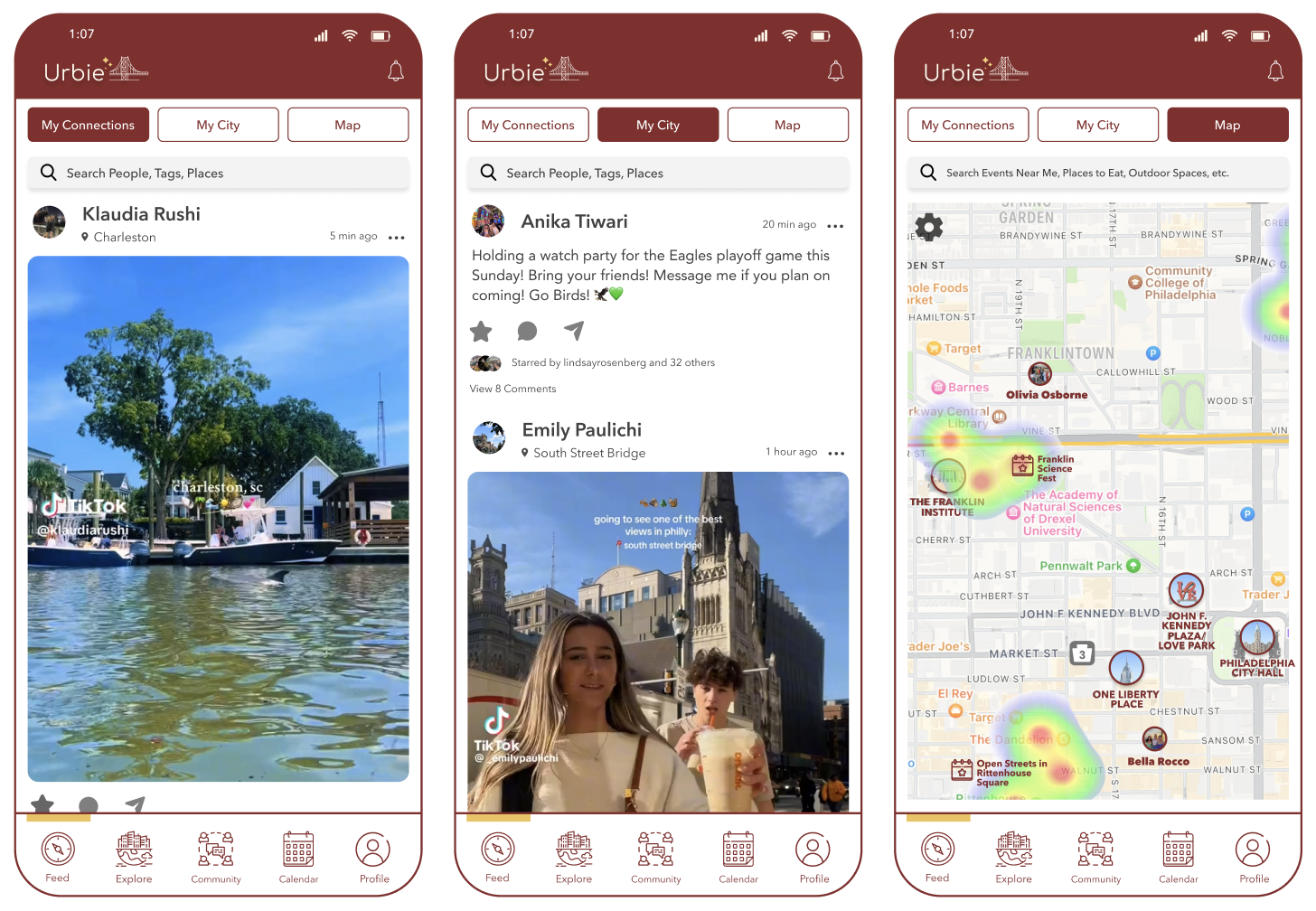
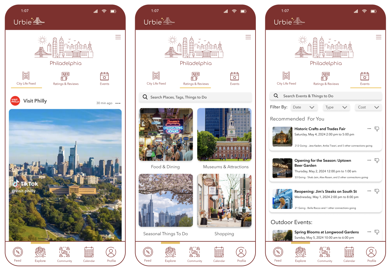
This project allowed me to take an idea from concept to an interactive prototype, combining user research, UI/UX design, and front-end development skills to imagine a social platform centered on community connection. From defining the core features like the feed, explore page, and community groups, to designing and linking screens in Figma for a clickable prototype, I focused on creating an experience that feels intuitive, engaging, and locally relevant. The process deepened my skills in interface design, prototyping, and feature planning, while reinforcing the importance of balancing visual appeal with usability.
Looking ahead, I’m excited to continue developing this concept into a fully functional app, integrating real-time data, mapping tools, and interactive community features that bring people closer to the places and interests that matter most to them. Ultimately, I see this app as a way to strengthen urban culture, making it easier for people to discover what makes their city unique, support local communities, and feel more deeply connected to the places they call home.